This was my first real freelance gig, and I learned a huge amount from working with a panel of clients who all wanted different things, and using supplied imagery which resulted in a lot of back and forth - I have learned that clear direction from me is important for this!
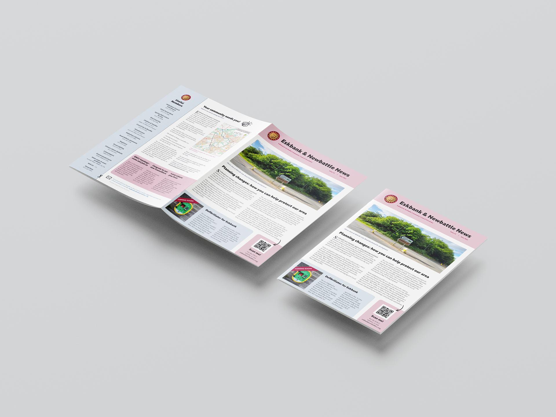
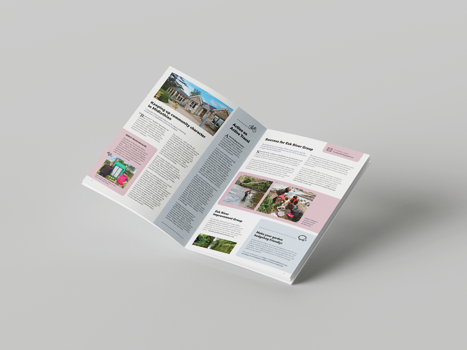
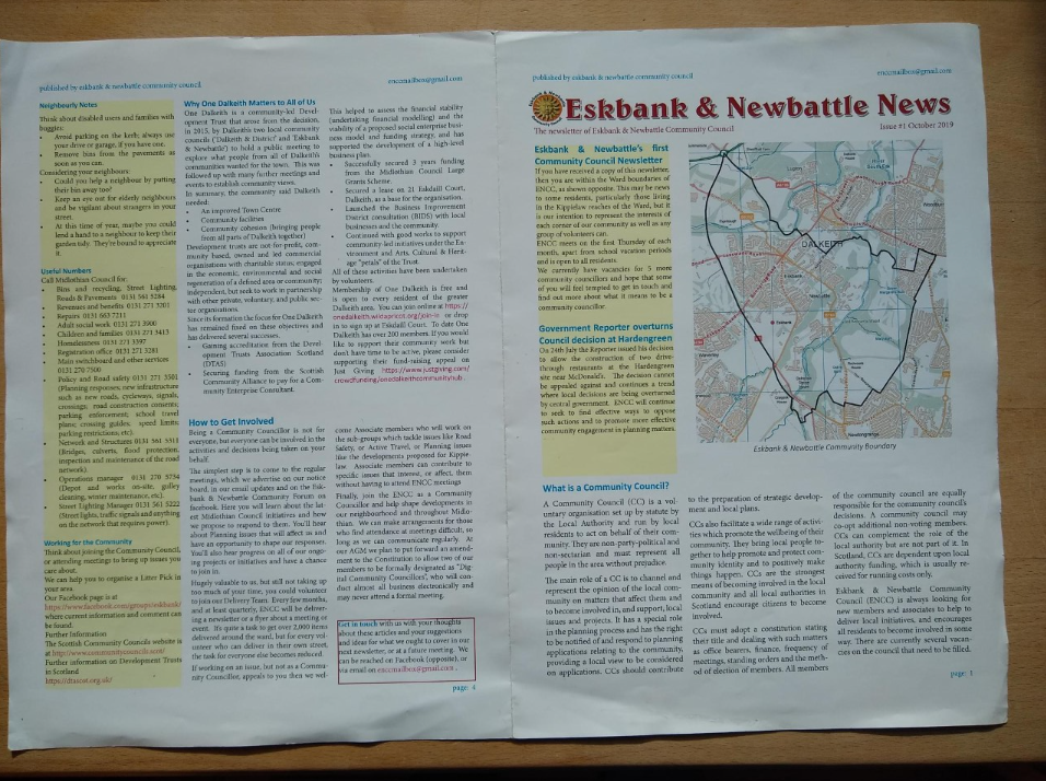
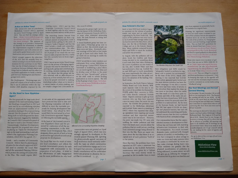
Most importantly the newsletter had to look eyecatching and friendly, while laying out news in an easily digestible and entertaining way. The council had found their original newsletter design used for over a decade (pictured here at the bottom) was being mistaken for junk mail, and was too cluttered for people to quickly scan and see if there was anything they wanted to read.
I focused on using colours of the area's crest (burgundy and blue) and using large images of relevant local locations to give the text some breathing room, simple icon illustrations to keep things uncluttered, and interactive elements like a QR code and a 'cut out and keep' important numbers list to keep people involved with the ENCC brand.
The refresh has worked well, with a remarkable increase in readership and engagement with the council.